Price Labels That Let the Object Speak First
Price label placement can make prices easy to match without obscuring merchandise. Learn how to pair labels, wording, and display positions with specific products.
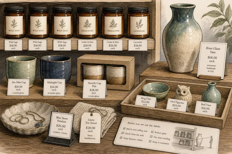
Price label placement should answer a shopper’s immediate question: which price belongs to this item? Put the information close enough to make the match clear, but not across a maker’s mark, finish, or feature someone wants to inspect. The best position depends on how the product is sold and how shoppers encounter it.
How do you match a label to the right product?
Start with the product’s selling unit. If one notebook is sold individually, its label should identify that notebook; if a stack shares one price, place the card where it clearly describes the stack. A label for a mixed tray needs more precision, because proximity alone may not tell shoppers which object it covers.
Use direct wording when the selling unit could be misunderstood. “Each,” “pair,” and “set” can distinguish an individual item from a bundle. If products in the same group have different prices, give them separate labels rather than asking shoppers to infer which price applies.
For a shelf of similar goods, keep cards beneath the items they describe and preserve the same left-to-right order as the products. On a table, a small card beside a single piece may work better than a tag attached to a delicate surface. Treat the label like a luggage tag: it should identify its own item, not merely sit nearby.
Which label format suits each kind of merchandise?
Choose the format around how the product is handled and displayed. A shelf-edge strip can suit stable rows, while a freestanding card can identify a featured object without touching it. A tag attached to merchandise travels with the item, but can cover a detail or catch on neighboring goods.
- Observation: A shelf holds identical jars in one clearly defined row. If one price applies to every jar, then use a shelf-edge label directly below the row; if jar prices differ, then use separate labels beneath the corresponding jars.
- Observation: A tabletop holds one ceramic vase with a visible maker’s mark. If a card beside the base remains easy to match, then use that position; if the card hides the mark or crowds the vase, then move it to a low stand beside the piece.
- Observation: A set of two items is displayed together but sold only as a pair. If shoppers can distinguish the pair from nearby stock, then use one card that says “pair”; if the grouping is unclear, then bring the items together or label them individually with explicit wording.
- Observation: A mixed tray contains products with different prices. If each product can be given a separate card, then place one beside each item; if cards would clutter the tray, then move products into clearly labeled groups or use attached tags that do not cover important details.
- Observation: A small handmade item has no flat surface for a card. If a nearby freestanding label stays connected to it, then use the stand; if neighboring items make the match uncertain, then add a short product name or move the item to a clearly defined spot.
- Observation: A glossy card reflects overhead lighting. If the price becomes hard to read from the aisle, then switch to matte stock or change the card’s angle; if the price remains clear, then keep the current format and avoid adding extra text.
What wording belongs on a retail price label?
Give the shopper the information needed to identify the item and understand its price. Depending on the merchandise, that may mean a product name, a price, and a brief material or maker detail. Keep secondary information short; care instructions and a longer maker story can sit on a separate product card or tag.
Make the selling arrangement explicit when it is not obvious. “Each” clarifies an individual price; “set” or “pair” identifies a bundle. For a display with several similar variants, add a distinguishing name or description so the price can be matched without lifting or rearranging merchandise.
Say you have three glazed cups on a shelf: two are sold individually, while the third is part of a boxed pair. Put a separate card below each loose cup with its price and a short glaze name. Place a separate card beside the box that says “pair,” so the boxed goods do not appear to share a single-cup price. The observable result is a direct match between each selling unit and its label, without covering the glaze.
How should label size and type serve the information?
Choose a card that fits the information rather than squeezing a paragraph onto a tiny tag. The price should be easy to pick out, while the product name and any useful detail remain readable. If the card needs more room, simplify the wording or use a separate information card instead of shrinking the type.
Consider the whole group of labels, too. A row of large, brightly colored cards can make the merchandise harder to distinguish, even if each card is readable by itself. Use a consistent stock and type treatment for comparable items, then make exceptions only when a product’s shape or selling unit needs a different format.
What should you check before setting out the labels?
Check the labels in the actual display, with the merchandise in its selling arrangement. Look from the aisle and from the place where someone would pause to browse. Use each observation to choose a specific adjustment:
- Observation: A label sits under the wrong item when read from left to right. If shifting it restores the correct pairing, then move it beneath that item; if product order changes often, then use individual tags or revise the shelf layout.
- Observation: A tag covers a maker’s mark, glaze, weave, or other distinguishing feature. If a nearby stand keeps the label readable, then use the stand; if it does not, then attach the tag to a less important area or use a shelf-edge card.
- Observation: A price is clear up close but obscured by a neighboring product from the aisle. If moving the card forward solves the problem, then reposition it; if the shelf lip is the clearer location, then move the label there and confirm its match to the item.
- Observation: A card’s reflection washes out the price under the shop lights. If a slight tilt removes the reflection, then keep the card and adjust its angle; if glare remains, then switch to matte paper.
- Observation: A shared card could describe more than one product. If a short phrase such as “each” or “set” resolves the ambiguity, then add it; if shoppers could still misread the scope, then separate the products or give them individual labels.
- Observation: A card needs smaller type to fit all its copy. If removing optional details makes the price and product name readable, then shorten the copy; if essential details still do not fit, then use a larger card or a separate information card.
Which price label questions come up most often?
Should every product have its own price label?
Use separate labels when prices or product variants differ, or when a shared card could be mistaken for a neighbor’s. One label can serve identical items sold under the same terms if it clearly identifies the group.
Are shelf-edge labels or attached tags better?
Shelf-edge labels keep merchandise clear and suit stable rows. Attached tags travel with items that move around, but position them away from delicate finishes, maker’s marks, and useful product details.
What if a product has no obvious place for a label?
Set a small card beside it or use a label on the display surface. Add a product name if neighboring goods make the match uncertain, and avoid fastening anything to a fragile or important area.
Should the price be the largest text?
The price should be easy to locate, but it does not need to dominate the card. Give it clear type and room, then keep the product name and extra detail secondary.
How can you tell if a label needs changing?
Ask whether the shopper can identify what the price covers without moving merchandise or guessing. If the answer is no, clarify the selling unit, separate the products, or change the card’s position. If the match is already clear, leave the label alone rather than adding copy that does not help someone decide.
Good price label placement is specific to the product’s selling unit: one card for a clearly grouped set, separate cards for distinct prices, and wording that removes doubt about “each” or “pair.” That small act of matching keeps the price useful and lets the item’s own details remain visible.